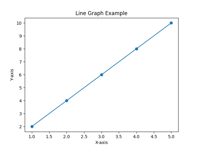
Line graphs
Line graphs, also known as line charts, are a type of graph that displays data points connected by straight lines. They are commonly used to represent and visualize the relationship between two continuous variables over a specific period or range.
Line graphs typically have two axes: a horizontal x-axis that represents the independent variable (such as time, distance, or categories), and a vertical y-axis that represents the dependent variable (such as temperature, sales, or quantity).
To create a line graph, data points are plotted on the graph at their respective x and y coordinates. The points are then connected by lines, forming a continuous line that represents the trend or pattern in the data. The resulting graph provides a visual representation of how the dependent variable changes in relation to the independent variable.
Line graphs are particularly useful for displaying trends, patterns, and fluctuations over time. They allow us to easily identify the overall direction of the data (increasing, decreasing, or staying relatively constant) and any notable variations or changes in the data series. Line graphs can also be used to compare multiple data series by plotting multiple lines on the same graph, each representing a different variable.
Line graphs are widely used in various fields, including finance, economics, science, and social sciences, to analyze and communicate data trends effectively.