heatmap (time series)

A heatmap (time series) is a type of data visualization that combines elements of both temporal and spatial representations. It is particularly useful for visualizing patterns and trends in data that vary over time and across different categories or dimensions.

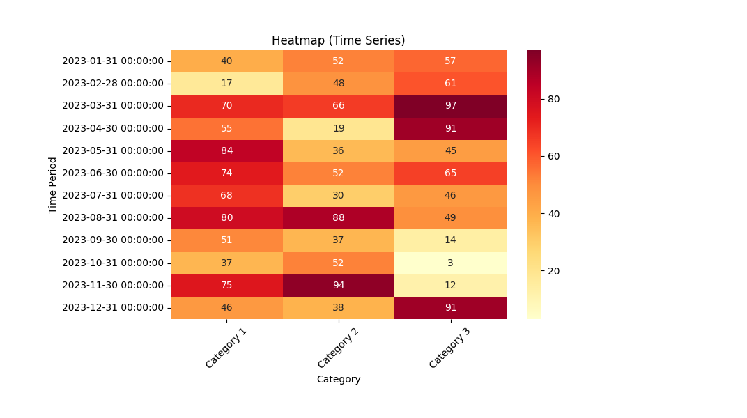
In a heatmap (time series), a rectangular grid is used to represent the data points, where each cell in the grid corresponds to a specific time period and category. The intensity of color or shading within each cell represents the magnitude or value of the data for that particular combination of time and category.

Typically, a color scale is used to map the data values to different colors or shades. For example, warmer colors like red or orange can indicate higher values, while cooler colors like blue or green can represent lower values. The color intensity or saturation provides a visual cue about the strength or magnitude of the data.

By observing the heatmap (time series), patterns and trends can be easily identified. For instance, you may notice darker shades or hotter colors in specific time periods and categories, indicating higher values or frequencies. This helps in spotting patterns, identifying anomalies, and understanding the relationships between variables over time.

Heatmaps (time series) are commonly used in various domains, including finance, climate science, sales analysis, and web analytics. They offer a powerful and intuitive way to explore and analyze complex data sets that involve both temporal and categorical dimensions.
Python Example

import numpy as np import pandas as pd import seaborn as sns import matplotlib.pyplot as plt # Create a sample dataset categories = ['Category 1', 'Category 2', 'Category 3'] time_periods = list(pd.date_range(start='2023-01-01', end='2023-12-31', freq='M')) for i in range(0,len(time_periods)): time_periods[i]=str(time_periods[i]) data = np.random.randint(low=0, high=100, size=(len(time_periods), len(categories))) df = pd.DataFrame(data, index=list(time_periods), columns=categories) # Create the heatmap plt.figure(figsize=(10, 6)) sns.heatmap(df, cmap='YlOrRd', annot=True, fmt='d', cbar=True) plt.title('Heatmap (Time Series)') plt.xlabel('Category') plt.ylabel('Time Period') plt.xticks(rotation=45) plt.yticks(rotation=0) plt.show()

In this example, we first create a sample dataset with three categories (Category 1, Category 2, and Category 3) and a range of time periods spanning from January 2023 to December 2023. The dataset is then represented as a Pandas DataFrame.

Next, we use the seaborn library to create the heatmap using the sns.heatmap() function. We pass the DataFrame df as the data to be visualized. We customize the color map (cmap) to use the 'YlOrRd' color palette, add annotations (annot=True) to display the data values within each cell, and format the annotations as integers (fmt='d'). The color bar (cbar=True) is included to indicate the color scale.

Finally, we add titles, labels, and rotate the x-axis labels for better readability. The resulting heatmap (time series) visualization will be displayed using plt.show().

heatmap result