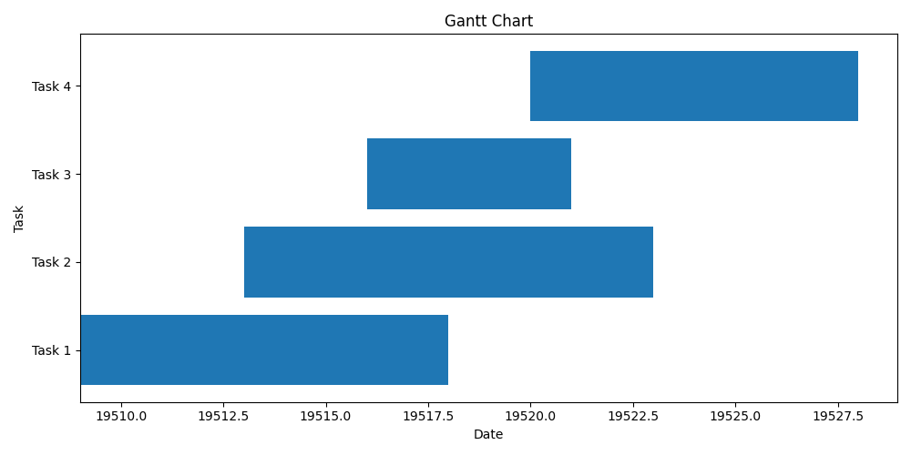
Gantt chart
A Gantt chart is a type of horizontal bar chart that is commonly used in project management to illustrate the scheduling and progress of tasks over time. It provides a visual representation of a project's timeline, showing the start and end dates of individual tasks, their durations, and how they relate to each other.
Here are the key components and features of a Gantt chart:
1. Task bars: Each task is represented by a horizontal bar on the chart. The length of the bar corresponds to the duration of the task, and its position along the timeline indicates the start and end dates.
2. Timeline: The chart typically has a horizontal timeline that represents the project's duration. It is divided into increments such as days, weeks, or months, depending on the scale of the project.
3. Dependencies: Gantt charts can show dependencies between tasks, indicating which tasks need to be completed before others can start. These dependencies are often shown as arrows connecting the related task bars.
4. Milestones: Milestones represent significant events or achievements within the project. They are usually depicted as vertical markers or special symbols on the chart, indicating important dates or key deliverables.
5. Resource allocation: Some Gantt charts also include information about the resources assigned to each task. This helps project managers visualize the workload and ensure that resources are appropriately allocated.
Gantt charts are particularly useful for planning, tracking, and communicating project schedules. They provide a clear overview of tasks, their durations, and their interdependencies, allowing project teams to identify critical paths, monitor progress, and make adjustments as needed. With the visual nature of Gantt charts, stakeholders can easily understand project timelines and the sequence of activities involved.