Candlestick charts

Candlestick charts are a type of financial chart used to represent the price movement of an asset, typically stocks, over a specific time period. They provide a visual depiction of price fluctuations and are widely used in technical analysis to analyze market trends and make informed trading decisions.

A candlestick consists of four main components: the open, high, low, and close prices for a given time interval, such as a day or an hour. Each candlestick on the chart represents this price data for that specific interval.

The body of the candlestick is a rectangular shape that represents the price range between the open and close prices. If the closing price is higher than the opening price, the body is usually filled or colored, often green or white. This indicates a bullish (positive) sentiment and suggests that the price increased during that time interval. Conversely, if the closing price is lower than the opening price, the body is usually unfilled or colored, often red or black, indicating a bearish (negative) sentiment and a price decrease.

The upper and lower lines, known as "wicks" or "shadows," extend vertically from the top and bottom of the body, representing the high and low prices reached during the time interval. They provide additional information about the price range and volatility.

By examining the patterns and formations of candlesticks over multiple time periods, traders can identify trends, reversals, and potential price patterns. This analysis helps them make predictions about future price movements and inform their trading strategies.

Candlestick charts provide a comprehensive visual representation of price data, making it easier to interpret and analyze market dynamics compared to other types of charts.
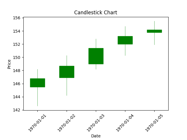
Python Example

import matplotlib.pyplot as plt from mplfinance.original_flavor import candlestick_ohlc import pandas as pd import matplotlib.dates as mdates # Sample data data = [ ['2023-06-18', 145.5, 148.2, 142.6, 146.8], ['2023-06-19', 146.9, 150.3, 144.2, 148.7], ['2023-06-20', 149.0, 152.8, 148.2, 151.4], ['2023-06-21', 152.0, 154.7, 150.3, 153.2], ['2023-06-22', 153.8, 155.5, 151.9, 154.2] ] # Convert data to a DataFrame df = pd.DataFrame(data, columns=['Date', 'Open', 'High', 'Low', 'Close']) # Convert 'Date' column to datetime df['Date'] = pd.to_datetime(df['Date']) # Set the 'Date' column as the index df.set_index('Date', inplace=True) # Create a new column with numerical index for plotting df['Index'] = range(len(df)) # Convert the DataFrame to the required format for candlestick_ohlc ohlc_data = df[['Index', 'Open', 'High', 'Low', 'Close']].values # Create the figure and axis objects fig, ax = plt.subplots() # Plot the candlestick chart candlestick_ohlc(ax, ohlc_data, width=0.5, colorup='g', colordown='r') # Format the x-axis to display dates ax.xaxis.set_major_formatter(mdates.DateFormatter('%Y-%m-%d')) ax.xaxis.set_major_locator(mdates.DayLocator()) # Rotate x-axis labels for better readability plt.xticks(rotation=45) # Set axis labels and title plt.xlabel('Date') plt.ylabel('Price') plt.title('Candlestick Chart') # Display the chart plt.show()

In this example, we create a DataFrame with sample data representing the open, high, low, and close prices for a few days. We convert the 'Date' column to a datetime type and set it as the index. Then, we convert the DataFrame to the required format for the candlestick_ohlc function from the mplfinance library. Finally, we plot the candlestick chart using candlestick_ohlc, format the x-axis to display dates, and add labels and a title to the chart. Running this code will generate a candlestick chart displaying the price movements over the specified time period.

cluster dendrogram result