Area charts
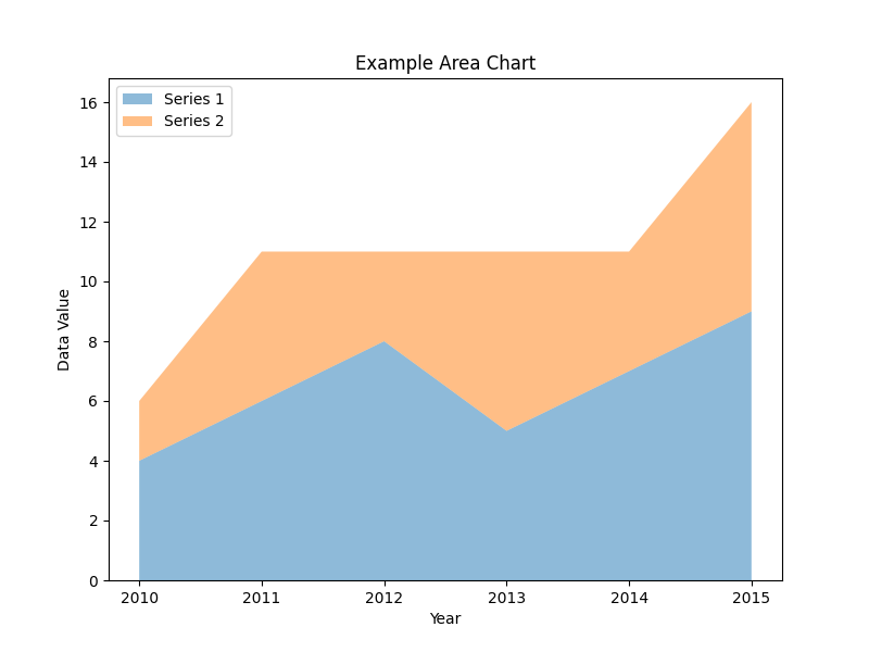
Area charts are a type of graph that visually represents quantitative data over a continuous interval or time period. They are similar to line graphs but have the area beneath the line filled with color or shading. The resulting shape formed by the line and the filled area creates a visual depiction of the cumulative values or proportions of the data.
In an area chart, the horizontal axis represents the independent variable, such as time, while the vertical axis represents the dependent variable, typically a numeric value. The data points are plotted on the graph, and the area between the line connecting these points and the horizontal axis is filled.
Area charts are useful for showing the overall trend and the magnitude of a dataset over time or a continuous scale. They are particularly effective for displaying cumulative data, such as tracking the total sales of a product over a period, as the filled area emphasizes the accumulation of values.
By comparing the areas between different lines or multiple data series on the same chart, you can observe the relative proportions and trends between different categories or variables. Area charts are especially helpful for identifying patterns, fluctuations, and changes in data over time.
It's worth noting that while area charts are excellent for displaying cumulative or aggregated data, they may not be suitable for precise comparisons between individual data points or for displaying individual data values. In such cases, other chart types like line graphs or bar charts may be more appropriate.