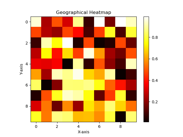
Heatmaps (geographical)
Heatmaps (geographical), also known as density maps, are a type of data visualization that represent the density or intensity of a particular phenomenon or data variable across a geographic area. They use colors or shading to indicate the relative concentration or distribution of the data values within a given region.
In a heatmap, each area or region on a map is divided into smaller units, such as grid cells or polygons. The color or shading of each unit corresponds to the magnitude or density of the data being visualized. Higher values or densities are typically represented by warmer colors like red or orange, while lower values or densities are represented by cooler colors like blue or green.
Heatmaps can be used to display a wide range of information. For example, they can depict population density, crime rates, average temperature, air pollution levels, or any other variable that can be measured and associated with a geographic location.
Heatmaps are effective in revealing patterns, clusters, and variations in the data across the geographical area. They allow viewers to quickly identify areas of high or low concentration and observe spatial trends or correlations. By using colors to represent data intensity, heatmaps make it easier to understand complex geographic patterns and make informed decisions based on the visualized information.