Flow maps

Flow maps are a type of spatial visualization that depict the movement or flow of objects, people, goods, or information between different locations or regions. They provide a visual representation of the paths and volumes of movement, helping to understand the spatial patterns and connections between origins and destinations.

Flow maps typically use lines or arrows to indicate the flow between locations. The width or thickness of the lines or arrows can represent the volume or magnitude of the flow. For example, a thicker line may indicate a higher volume of goods being transported between two cities.

One of the key features of flow maps is that they emphasize the directional nature of movement. Arrows or lines often have specific start and end points, showing the origin and destination of the flow. This directional information is crucial in understanding the interactions and relationships between different regions.

Flow maps can be used to visualize various types of movements, such as migration patterns, trade routes, transportation networks, or communication flows. They can provide insights into the connections between different regions, identify transportation bottlenecks, analyze the impact of infrastructure changes, or help plan logistics and resource allocation.

By using flow maps, complex movement patterns can be simplified and communicated effectively, allowing viewers to grasp the spatial relationships and dynamics of the flows at a glance.
Python Example

import matplotlib.pyplot as plt import numpy as np # Generate random flow data num_flows = 50 x = np.random.rand(num_flows) # X-coordinate of flow start points y = np.random.rand(num_flows) # Y-coordinate of flow start points dx = np.random.randn(num_flows) * 0.1 # X-component of flow vectors dy = np.random.randn(num_flows) * 0.1 # Y-component of flow vectors flows = np.column_stack([x, y, dx, dy]) # Combine flow data # Create a scatter plot to represent flow start points plt.scatter(x, y, color='blue', alpha=0.5) # Add flow lines to the plot for flow in flows: plt.arrow(flow[0], flow[1], flow[2], flow[3], color='red', alpha=0.3, head_width=0.02, head_length=0.02) # Set plot title and axis labels plt.title('Flow Map') plt.xlabel('X-coordinate') plt.ylabel('Y-coordinate') # Set plot limits plt.xlim(0, 1) plt.ylim(0, 1) # Display the plot plt.show()

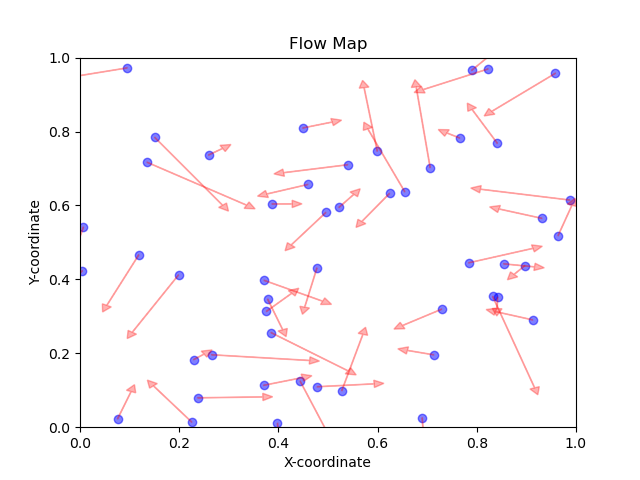
In this example, we first generate random flow data consisting of start points (x and y coordinates) and flow vectors (dx and dy components). We then use Matplotlib to create a scatter plot to represent the start points as blue dots, and arrows are added to represent the flows using the arrow() function. The plot is then customized with a title, axis labels, and limits before being displayed using plt.show().

Note that this is a basic example, and you can customize the visualization further by adjusting colors, line styles, arrow sizes, or incorporating real data to create more meaningful flow maps.

flow map result