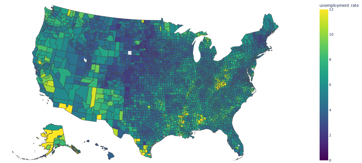
Choropleth
Choropleth maps are a type of spatial visualization that represent data using different colors or patterns to depict variations across geographic regions, such as countries, states, or counties. The term "choropleth" comes from the Greek words "choros" (region) and "plethos" (multitude).
In a choropleth map, regions are shaded or colored based on a particular data variable or attribute. The intensity or darkness of the color indicates the magnitude or value of that variable within each region. This allows for a quick visual comparison of the data across different regions.
Here's a simplified example to help illustrate the concept: Let's say you have a choropleth map of a country, and you want to visualize the population density of different states. You would assign a color spectrum, such as lighter colors for lower population density and darker colors for higher population density. Each state would be filled with a color corresponding to its population density value, allowing viewers to easily identify regions with high or low population concentration.
Choropleth maps are commonly used to represent various types of data, such as demographic information, socioeconomic indicators, election results, and environmental factors. They provide an effective way to communicate spatial patterns and disparities, making it easier to understand and compare data across different geographic areas.