Bubble maps
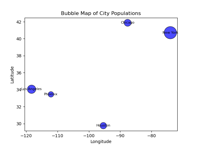
Bubble maps, also known as proportional symbol maps, are a type of spatial visualization that represents data using bubbles or circles placed on a map. Each bubble represents a specific location or geographic area, and its size is proportional to a particular numerical value or attribute associated with that location.
Bubble maps are effective in visualizing data that has a geographic component and a quantitative aspect. They provide a quick and intuitive way to compare values across different locations and identify spatial patterns or disparities.
The key characteristics of bubble maps include:
1. Location: Bubble maps are geographically based, with bubbles placed at specific coordinates on a map corresponding to their respective locations.
2. Size: The size of each bubble represents a quantitative variable. For example, the population of a city, the sales revenue of a store, or the number of COVID-19 cases in a region.
3. Color: In addition to size, bubbles can be further enhanced by color coding to convey an additional data dimension. For example, the color of a bubble could indicate a different attribute or category.
By visualizing data as bubbles on a map, bubble maps allow for a quick assessment of spatial distribution and concentration. They can reveal clusters, outliers, and gradients, enabling viewers to identify areas of interest or potential relationships between variables. This type of visualization is commonly used in fields such as geography, demographics, business analytics, and public health, among others.