Radar charts
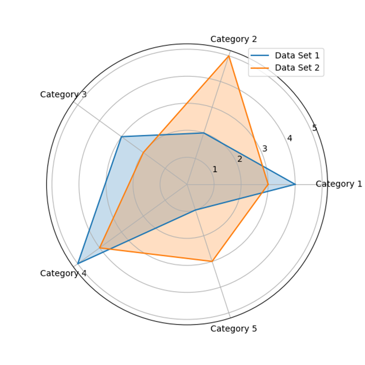
Radar charts, also known as spider charts or star plots, are a type of data visualization that represents multivariate data in a two-dimensional, circular format. They are particularly useful for comparing multiple variables or data points across different categories or dimensions. Radar charts are called so because the lines connecting the data points radiate from a common center, resembling a spider's web or a star shape.
Here's how radar charts work:
1. Data Points: Each variable or data point is represented by a point on the chart. These points are placed along the individual axes that extend from the center of the chart to the outer edges. The number of axes corresponds to the number of variables being compared.
2. Connecting Lines: Lines are drawn to connect the data points of each variable, creating a polygonal shape. The area enclosed by the lines represents the data's magnitude or value for that specific data point.
3. Multiple Data Sets: Radar charts are especially useful when comparing multiple data sets. Each data set is typically represented by a separate polygonal shape, often with different colors or shading for easy distinction.
4. Normalization: Since radar charts use axes with different scales, it is essential to normalize the data to ensure fair comparisons. Normalization involves scaling the data points so that they fall within a standard range (e.g., 0 to 1) to remove any bias caused by different scales.
Radar charts are useful for quickly identifying patterns, similarities, and differences between data sets. They are commonly used in fields like market research, sports analytics, and performance evaluations, where multiple metrics need to be compared simultaneously. However, it's essential to be cautious when using radar charts, as the interpretation can become challenging when dealing with complex data or numerous variables. In such cases, other visualization types like parallel coordinate plots or stacked bar charts might be more appropriate.