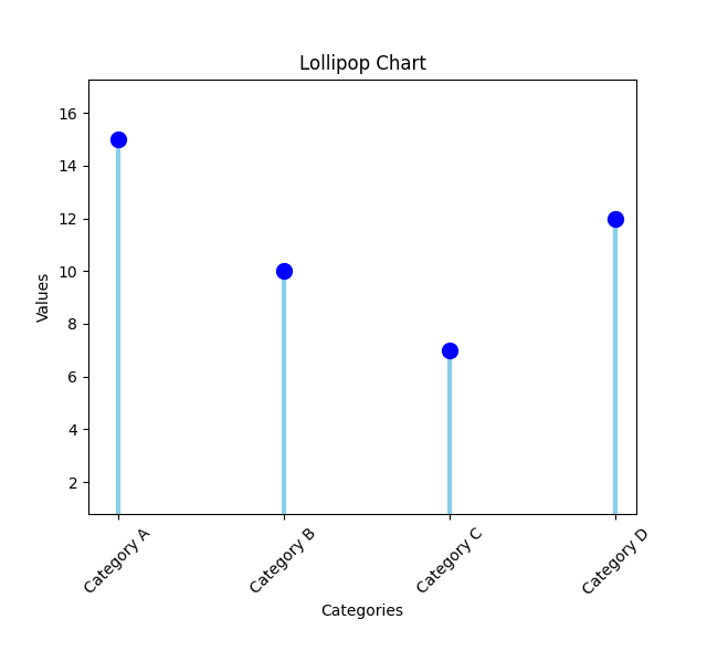
Lollipop chart
A lollipop chart, also known as a lollipop plot or a dot plot with lines, is a type of graph used to display and compare values between different categories. It combines elements of both bar charts and scatter plots. The chart consists of markers (usually circles) representing the data points plotted on a horizontal axis, and each marker is connected to a vertical line or stem. The length of the line indicates the value associated with the data point.
Here's a step-by-step explanation of how to interpret a lollipop chart:
1. Categories: The horizontal axis represents the categories or groups being compared. It could be anything from different products, cities, or time periods.
2. Data Points: Each category has a corresponding data point represented by a circle marker on the horizontal axis. The position of the marker along the axis indicates the category it belongs to.
3. Values: The vertical axis represents the values associated with the data points. The scale on the vertical axis varies depending on the range of values being represented.
4. Lines or Stems: A vertical line or stem connects the data point (circle marker) to the corresponding value on the vertical axis. The length of the line indicates the magnitude or size of the value.
Lollipop charts are particularly useful when you want to highlight and compare values within different categories. They provide a clear visual representation of the data points while emphasizing the differences in values using the length of the lines. Additionally, lollipop charts can be easily customized with additional features such as color-coding, labels, or tooltips to enhance the clarity and interpretation of the data.