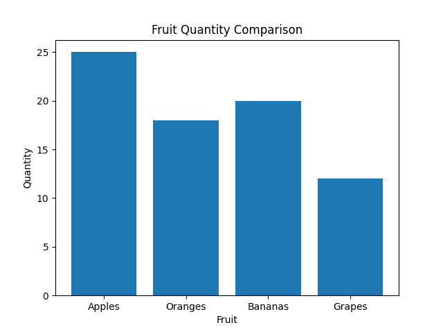
Bar charts
Bar charts are a popular type of graph used for visualizing categorical or discrete data. They display data using rectangular bars of varying lengths, where the length of each bar represents the magnitude or frequency of a particular category or data point.
Here's a step-by-step explanation of how bar charts work:
1. Data Categories: Bar charts are suitable for data that can be divided into distinct categories or groups. For example, you might have data on different types of fruits, sales figures for different months, or survey responses categorized by age groups.
2. Horizontal and Vertical Axes: A bar chart typically has two axes: the vertical (y-axis) and the horizontal (x-axis). The vertical axis represents the measured values or frequencies, while the horizontal axis represents the categories or groups.
3. Bars: The bars in a bar chart are drawn perpendicular to the horizontal axis. The length or height of each bar represents the value or frequency associated with the corresponding category on the horizontal axis.
4. Bar Length: The length of each bar is determined by the magnitude of the data it represents. Longer bars indicate larger values or frequencies, while shorter bars represent smaller values.
5. Bar Width: The width of the bars is usually consistent throughout the chart. It helps maintain uniformity and clarity when comparing the lengths of different bars.
6. Color or Pattern: Bar charts often use different colors or patterns to differentiate between categories or to convey additional information. This can help make the chart visually appealing and easier to interpret.
Bar charts are effective for comparing data across categories and identifying patterns, trends, or disparities. They provide a straightforward and intuitive representation of data, making it easier to understand and draw insights.