Sunburst chart

A Sunburst chart is a type of hierarchical visualization that represents data in a circular, multilevel format. It is named "sunburst" because its appearance resembles the rays of the sun.

The chart starts with a central circle, which represents the root or the top-level category of the data. From the central circle, "branches" radiate outward, dividing the circle into sections. These sections are proportional in size to the values or proportions they represent.

Each section can be further divided into smaller sections, creating a hierarchical structure. The subdivisions are displayed as concentric rings, where each ring represents a lower level in the hierarchy. The size of each ring segment corresponds to the value or proportion of the data it represents.

Sunburst charts are particularly useful for displaying hierarchical or nested data with multiple levels. They allow you to visualize the composition and proportions of each level in a visually appealing manner. By leveraging color and size, they can effectively convey information about the relative importance or distribution of data elements.

Sunburst charts are commonly used in various fields, such as data analysis, finance, marketing, and organizational hierarchies, to explore and communicate complex hierarchical structures and relationships.
Python Example

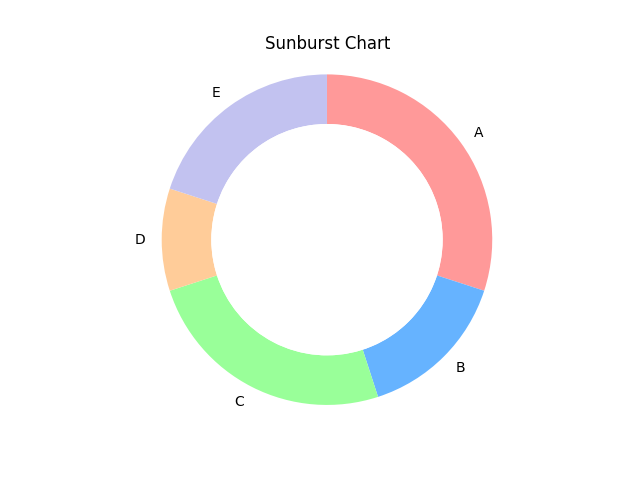
import matplotlib.pyplot as plt # Sample data for the Sunburst chart labels = ['A', 'B', 'C', 'D', 'E'] sizes = [30, 15, 25, 10, 20] colors = ['#ff9999', '#66b3ff', '#99ff99', '#ffcc99', '#c2c2f0'] # Creating the Sunburst chart fig, ax = plt.subplots() ax.pie(sizes, labels=labels, colors=colors, startangle=90, counterclock=False, wedgeprops=dict(width=0.3)) # Adding a circle in the center to create the "sunburst" effect centre_circle = plt.Circle((0, 0), 0.70, fc='white') fig.gca().add_artist(centre_circle) # Equal aspect ratio ensures that the chart appears as a circle ax.axis('equal') # Displaying the Sunburst chart plt.title("Sunburst Chart") plt.show()

In this example, we define sample data for the chart: labels represent the categories or levels, sizes represent the values or proportions, and colors represent the colors for each category.

Using Matplotlib's pie function, we create a pie chart using the sizes, labels, and colors data. We set the startangle to 90 degrees to make the chart start from the top. The counterclock parameter is set to False to arrange the wedges in a clockwise manner. The wedgeprops parameter is used to specify the width of the wedges to create the desired spacing between them.

To achieve the "sunburst" effect, we add a white circle in the center of the chart using the Circle function from Matplotlib. This circle overlays the center of the chart and gives the appearance of rays radiating outward.

Finally, we set the axis to have an equal aspect ratio to ensure the chart appears as a circle. We add a title to the chart and display it using plt.show().

Sunburst Chart result