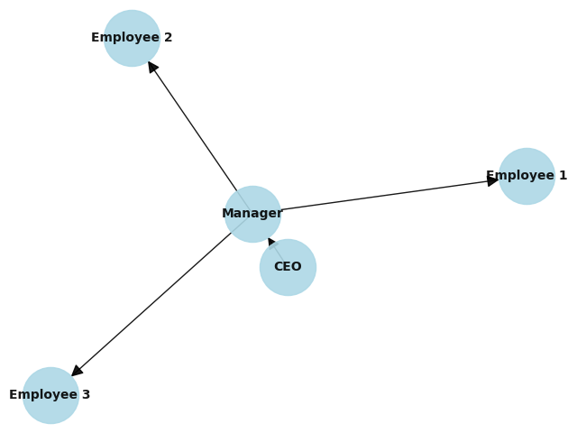
Organizational charts
Organizational charts, also known as org charts or hierarchy charts, are graphical representations of the structure and relationships within an organization. They visually depict the positions, roles, and reporting relationships of individuals or departments within a company or any other type of institution.
Organizational charts typically use a hierarchical structure, where the highest level represents the top management or leadership positions, and the lower levels represent various departments, teams, or individuals within the organization. Each level is usually represented by boxes or shapes, with lines or arrows indicating the reporting or communication paths.
The main purpose of an organizational chart is to provide a clear visual representation of the formal structure of an organization, including the chain of command, decision-making lines, and how different parts of the organization are interconnected. It helps employees understand their roles and responsibilities, shows who they report to, and allows them to see how their work fits into the larger organizational structure.
Organizational charts can be simple or complex, depending on the size and complexity of the organization. They are commonly used in businesses, government agencies, non-profit organizations, and other institutions to enhance communication, streamline workflows, and facilitate understanding of the organizational hierarchy.