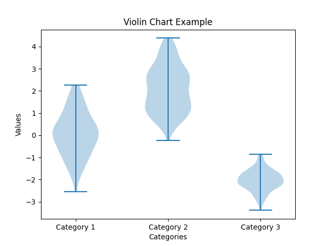
Violin chart
A violin chart, also known as a violin plot, is a type of data visualization that combines aspects of a box plot with a kernel density plot. It is used to display the distribution of a numeric variable or multiple variables across different categories or groups.
A violin chart typically consists of one or more "violins," which are mirrored, symmetrical shapes resembling violins or viola. Each violin represents a category or group, and its width corresponds to the frequency or density of data points at different values along the y-axis.
The key components of a violin chart are:
1. Violin Body: The central part of the chart represents the distribution of the data. It typically displays a kernel density plot, which shows the probability density of the data at various values. The width of the violin at a given point indicates the density of data points at that value.
2. Interquartile Range (IQR): Inside the violin body, a box plot-like representation is often included to show the quartiles (25th, 50th, and 75th percentiles) of the data. This provides information about the spread and central tendency of the distribution.
3. Whiskers: Instead of traditional whiskers, violin charts often use lines that extend from the edges of the violin body to represent the minimum and maximum values of the data.
Violin charts are particularly useful when you want to compare the distribution of a variable across different categories or groups. They provide insights into the shape of the distribution, such as the presence of multiple modes, skewness, or symmetry. They can also reveal differences in spread and central tendency between categories. Violin charts are commonly used in statistical analysis, data exploration, and data-driven storytelling.