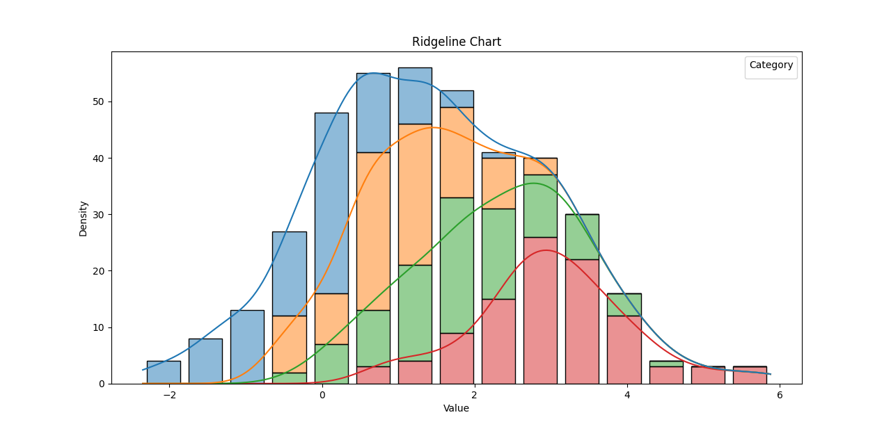
Ridgeline charts
Ridgeline charts, also known as joyplots or density plots, are a type of data visualization that allows you to display the distribution of a numeric variable across multiple categories. They are useful when you want to compare the distribution of data among different groups or time periods.
The main feature of a ridgeline chart is that it stacks multiple density plots vertically, one above the other. Each density plot represents the distribution of the numeric variable for a specific category or group. The plots are aligned along a common horizontal axis, making it easy to compare the shape, spread, and central tendency of the data across different categories.
Ridgeline charts are particularly effective for visualizing how the distribution of a variable changes over time or across different subgroups. By combining multiple density plots in a compact layout, they can reveal patterns and insights that might be challenging to see in other types of graphs.
The name "ridgeline" comes from the ridges formed by the overlapping density plots, creating a distinctive mountain-like appearance. The width and height of the ridges represent the density of data points in that region, with higher density areas appearing wider and more prominent.
Ridgeline charts are not as widely used as other types of graphs like bar charts or scatter plots, but they can be a powerful tool for understanding the distributional characteristics of data when dealing with multiple categories or groups.