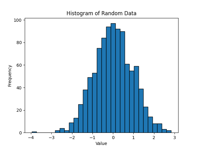
Histogram
A histogram chart is a graphical representation of data that displays the distribution of a continuous variable. It divides the range of values into a set of intervals, or "bins," and shows the frequency or count of data points falling into each bin. Histograms are especially useful for understanding the shape, central tendency, and spread of a dataset.
Here's how a histogram is created:
1. Data Binning: The range of values for the variable of interest is divided into equal-sized intervals or bins. The number of bins can vary, but it's typically chosen based on the dataset size and the desired level of detail.
2. Frequency Count: The number of data points that fall into each bin is calculated. This is often represented on the vertical axis of the histogram.
3. Bar Representation: Rectangular bars are drawn on the graph, with the width representing the bin's range and the height indicating the frequency or count of data points within that bin.
4. No Gaps: The bars in a histogram are typically drawn adjacent to each other, without any gaps, as the variable is continuous and there is no natural separation between adjacent bins.
Histograms allow you to visualize the distribution of data and identify patterns such as peaks, gaps, and skewness. They provide insights into the spread (variance), central tendency (mean, median), and presence of outliers within a dataset. The shape of the histogram can take various forms, such as normal (bell-shaped), skewed, bimodal (having two peaks), or uniform.
Histograms are commonly used in fields like statistics, data analysis, and data science to explore and understand the characteristics of a dataset and to make informed decisions based on its distribution.