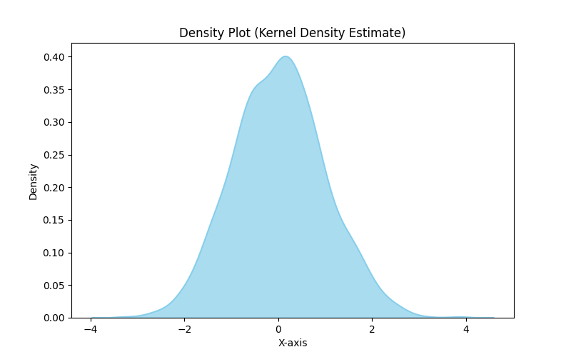
Density charts
Density charts, also known as density plots or kernel density plots, are a type of data visualization that represents the distribution of a continuous variable. They provide insights into the shape and concentration of data points along the range of values.
Instead of showing individual data points like in a scatter plot, density charts estimate and display the probability density function (PDF) of the data. The PDF represents the likelihood of a given value occurring within the dataset.
Density charts use a smooth curve to represent the distribution, which is derived from a mathematical function called a kernel. The kernel represents a smooth, symmetric, and bell-shaped curve centered on each data point. By summing up these individual kernels, a smooth density curve is created.
The density curve typically has the y-axis representing the density or probability density, while the x-axis represents the range of values for the variable being analyzed. The height of the curve at a particular point indicates the relative concentration of data points around that value. Areas under the curve represent the probability of observing data within specific ranges.
Density charts are particularly useful for visualizing continuous variables with large datasets or when comparing multiple distributions. They can reveal information about the shape of the data, such as whether it is symmetric, skewed, or multimodal. They also enable the identification of peaks, valleys, and areas of high or low density within the data distribution.
Common variations of density charts include the kernel density estimate (KDE), which is a non-parametric approach, and the smoothed histogram, which approximates the density using bins. These variations provide flexibility in visualizing different types of data and offer different levels of detail and smoothness.