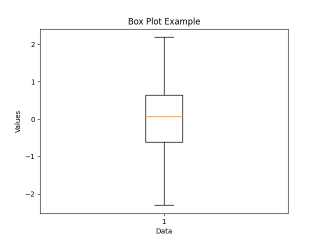
Box plot
A box plot, also known as a box-and-whisker plot, is a statistical visualization tool that provides a summary of a dataset's distribution. It displays key descriptive statistics and highlights the spread and skewness of the data.
Here's a breakdown of the components of a box plot:
1. Median: The box plot includes a line or a dot inside a box, which represents the median of the dataset. The median is the value that divides the data into two equal halves, with 50% of the data points below it and 50% above it.
2. Quartiles: The box itself spans the interquartile range (IQR), which is the middle 50% of the data. The lower edge of the box corresponds to the first quartile (Q1), which marks the 25th percentile of the data. The upper edge of the box corresponds to the third quartile (Q3), marking the 75th percentile.
3. Whiskers: The whiskers extend from the box to indicate the range of the data. By default, the whiskers extend to a length of 1.5 times the IQR. However, they can vary depending on the specific implementation or the presence of outliers. Outliers, which are data points located outside the whiskers, are typically plotted as individual points.
4. Minimum and Maximum: The endpoints of the whiskers represent the minimum and maximum values within the dataset that fall within the acceptable range (1.5 times the IQR by default).
Box plots provide a concise and visual representation of the data distribution, showing the central tendency (median) and the spread (IQR and whiskers) of the dataset. They are useful for identifying outliers, comparing distributions, and detecting skewness. Box plots are commonly used in statistical analysis, exploratory data analysis, and data presentations.