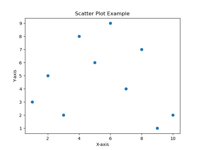
Scatter plot
A scatter plot is a type of graph used to display the relationship between two continuous variables. It visually represents the correlation or pattern between these variables. The graph consists of a horizontal x-axis that represents one variable and a vertical y-axis that represents the other variable.
In a scatter plot, each data point is plotted as a single dot or marker on the graph, with its position determined by the values of the two variables it represents. The x-coordinate of a data point corresponds to the value of one variable, while the y-coordinate corresponds to the value of the other variable.
By examining the distribution and clustering of the data points on the scatter plot, you can gain insights into the relationship between the variables. The general patterns that can be observed in scatter plots include:
1. Positive correlation: The data points tend to form an upward sloping pattern from left to right, indicating that as one variable increases, the other variable tends to increase as well.
2. Negative correlation: The data points tend to form a downward sloping pattern from left to right, indicating that as one variable increases, the other variable tends to decrease.
3. No correlation: The data points appear to have no discernible pattern or relationship, scattered randomly across the graph.
Scatter plots are especially useful for identifying outliers, clusters, or trends in the data. They are commonly used in various fields such as statistics, data analysis, and scientific research to explore relationships and discover insights between two continuous variables.