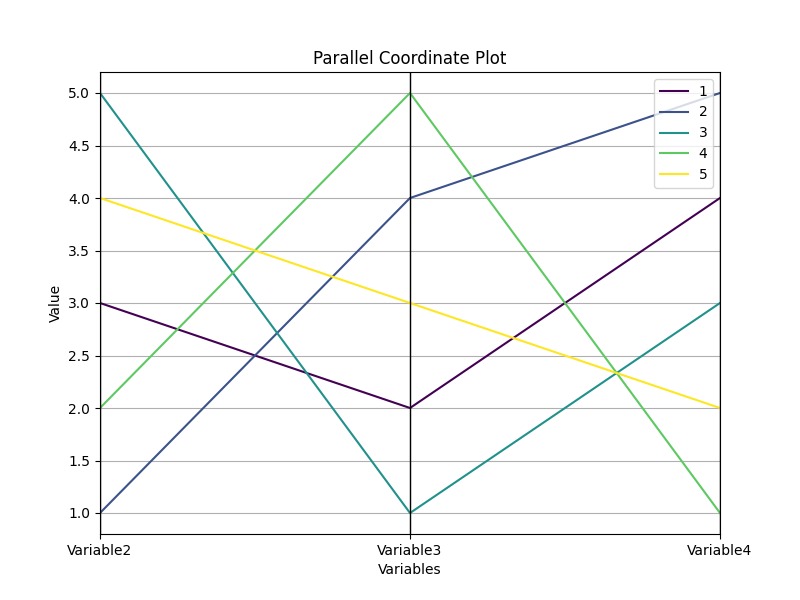
Parallel coordinates
A parallel coordinate plot, also known as a parallel coordinates chart or parallel coordinates plot, is a type of visualization that allows you to explore relationships between multiple variables or dimensions simultaneously. It is particularly useful when working with datasets that have many variables.
In a parallel coordinate plot, each variable is represented by a vertical axis or line, and these axes are placed parallel to each other. The values of each variable are then plotted as connected points or lines across these axes. The data points are connected by line segments, creating a series of parallel lines that run across the chart.
To interpret the plot, you follow the lines as they intersect or cross the axes. The position of a data point on each axis indicates the value of that variable for that particular data point. By observing the pattern of lines and their intersections, you can identify relationships, trends, or patterns across multiple variables.
Parallel coordinate plots are especially useful for identifying correlations, spotting outliers, and understanding the distribution and behavior of data across multiple dimensions. They are commonly used in fields such as data analysis, multivariate analysis, and data mining to gain insights into complex datasets.
By visually representing multiple variables in parallel, these plots provide a way to explore and compare data points across dimensions, allowing analysts to make more informed decisions and discoveries from the data.