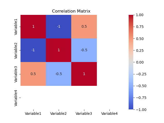
Correlation matrix
A correlation matrix is a type of visual representation that displays the correlations between multiple variables in a tabular form. It provides a convenient way to examine the relationships and patterns among different pairs of variables in a dataset.
In a correlation matrix, each variable is listed both in the rows and columns of a square matrix. The diagonal elements of the matrix represent the correlation of each variable with itself, which is always 1 since a variable perfectly correlates with itself. The off-diagonal elements represent the pairwise correlations between different variables.
The correlation values in the matrix range from -1 to 1. A correlation coefficient of 1 indicates a perfect positive correlation, meaning that the variables move in the same direction. A correlation coefficient of -1 indicates a perfect negative correlation, where the variables move in opposite directions. A correlation coefficient of 0 suggests no linear relationship between the variables.
The correlation matrix is often visually enhanced by using color gradients or shading to highlight the strength and direction of the correlations. For example, a darker color or a different hue might be used to indicate stronger positive or negative correlations, while a lighter color or no color might represent weaker correlations or no correlation at all.
Correlation matrices are useful for identifying relationships and dependencies between variables. They are commonly employed in fields such as statistics, finance, social sciences, and data analysis to explore patterns, detect multicollinearity (high intercorrelations), and guide decision-making based on the strength and direction of associations between variables.